
Best A+ Content on Amazon

Amazon allows brand owners on Vendor Central (1P) and Seller Central (3P) to create additional marketing collateral on a product page tied to that brand. This content has always been referred to as A+ Content on Vendor Central and until recently it was referred to as Enhanced Brand Content (EBC) on Seller Central. Amazon has recently merged them into a similar format and now refers to them both as A+ Content.
If you are a brand owner with branded product pages (ASINs) you should do everything in your power to create stunning content for each of your products. This tool gives you a rich storytelling medium to tell your unique brand story and explain your product features. Per Amazon, adding A+ content to your product detail pages can result in higher conversion rates, increased traffic and increased sales. In our experience, we have found that it helps boost conversions, sales and sales rank and we would never consider a product listing complete without it.
Please note, there is no evidence, as of today, that this content adds SEO value to you Amazon listings. As Amazon evolves, the likelihood is strong that Amazon’s Search Algorithm (A9) will eventually index this content. Therefore, Lean Edge Marketing would suggest that you design your A+ Content so that it would have index value for your product. We would refrain from creating content where valuable keywords are hidden in pictures, even if they are visually more pleasing.
When you are creating your own content, you should carefully research your competition. Be inspired by what they are doing right and outdo what they haven’t mastered. Then tell the story of your brand and product in a way that will convince a customer to convert.
Best Amazon A+ Pages
With over 10 million products listed on Amazon, we wanted to showcase examples of brands big and small that are using this feature effectively. Without further ado, we will share what we thought were some of the best examples of how to use A+ / Enhanced Brand Content.
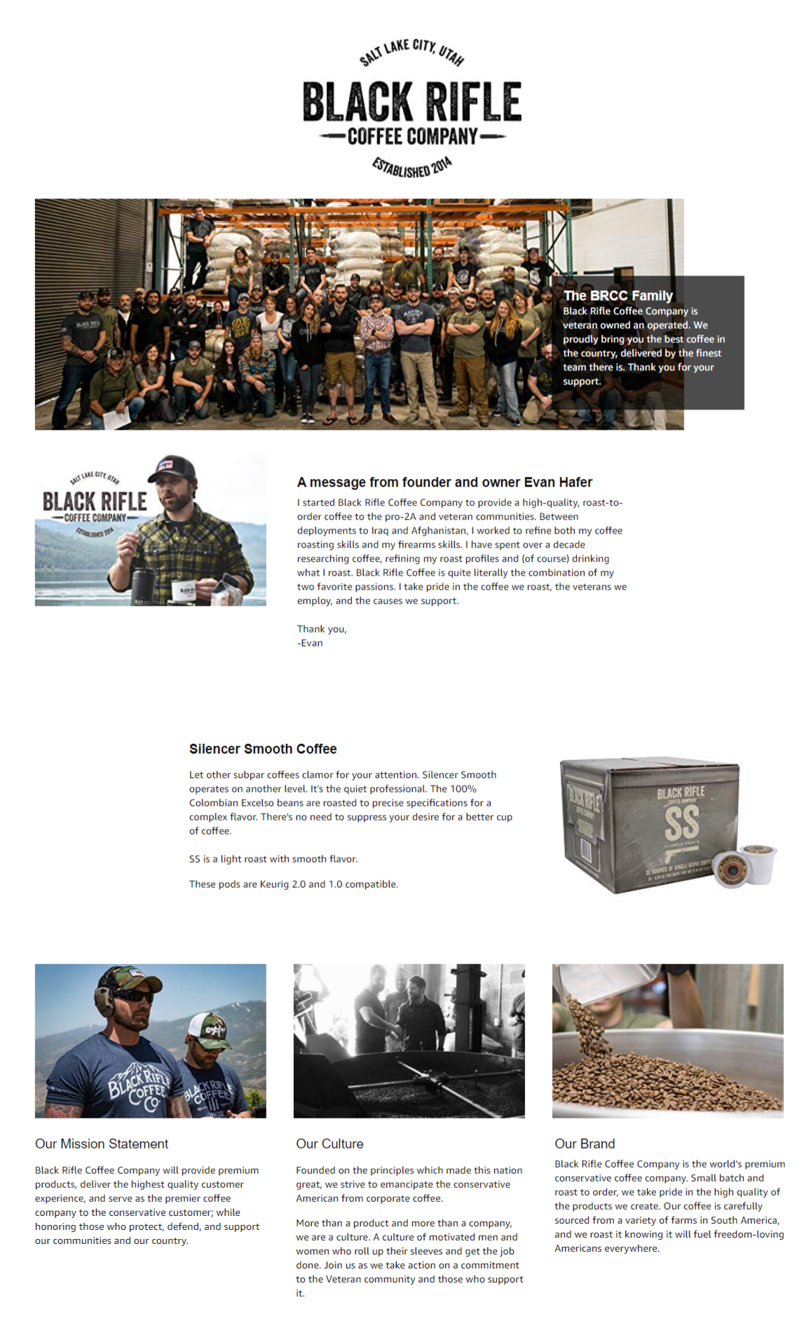
Black Rifle Coffee Company’s product page is an excellent example of a company telling it’s unique brand story through it’s A+ content. As a buyer you will develop a good feel for the brand and the company behind it. If you are searching for a new coffee brand, you will be captivated by this story of a Veteran supporting Veterans business and are more likely to convert.

Columbia approached it’s A+ Content in a unique way. It covered the unique product features of this item and included a visually dazzling size chart that combined important information with stunning lifestyle photography.

Sargent Art created a visually impressive piece of A+ content. It’s bright and catches your attention. You quickly understand the product and are captivated by it. You can compare it to their other products for cross-sell and up-sell opportunities. Unfortunately, this content does lack keyword-rich SEO copy which won’t hurt their rankings now, but may impact them in the future.

This A+ Content feels a bit incomplete but we still find it enticing. It features bright colors and great product and lifestyle photography. Unlike most branded content, this product chooses to lead with the product details and finish with the brand.

Bee’s Wrap utilizes rich copy and descriptive photography to introduce their new eco-friendly product to the world. They effectively use copy and photography to educate and inform the customer about what their product is and how to use it.

Linenspa effectively uses informative pictures and color to draw a customer through their key product attributes and marketing copy. They make good use of cross-sections, diagrams and iconography. They strike a good balance with informative imagery, product photography and text. The only negative is that they have placed most of their key text in images.

Modeker has found a good balance between text and photography that clearly defines their product and what can be done with it.

Maxi-Cosi leverages their A+ Content to introduce their brand and product to the Amazon customer with an effective mix of professional lifestyle and product photography and product copy.

While it may need no introduction, the product detail page for Scotch Packaging Tape effectively reminds the customer of what they can use the product for and cross-sells other Scotch brand products.

VIcTsing has created a striking mix of informational graphics and rich product photography to effectively sell their product. The copy while not terrible, could use a native English speaker to correct translation errors, something we suggest for every product listing translated into a non-native language.

Dream Paris did something unusual with their A+ Content, they led their content with cross-sell items. If you prefer a different option - you can select it right away without moving on to another product. It would be interesting to know if they A/B tested this content decision and if it was more effective for their product line.
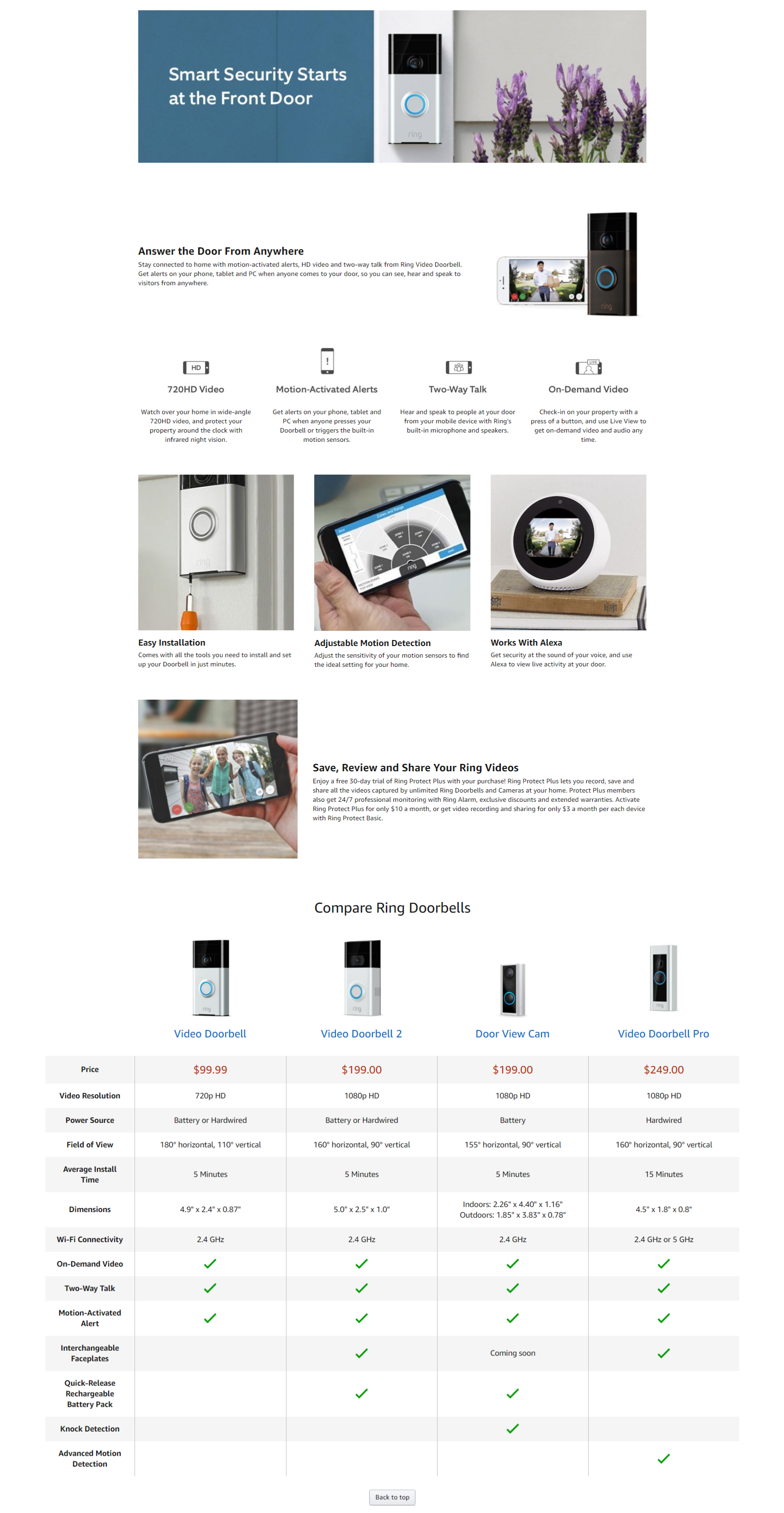
Ring, an Amazon owned product, nicely introduces their brand and product at the beginning of their A+ Content. They make good use of using icons to call out key product features, photography to showcase others and a product comparison chart to convey key product details and cross-sell items.

While it’s lacking the polish of a bigger brand, Trunki cleverly guides you through it’s A+ content with color transitions and mix of product, informative and lifestyle graphics. They complete their listing with their brand story.
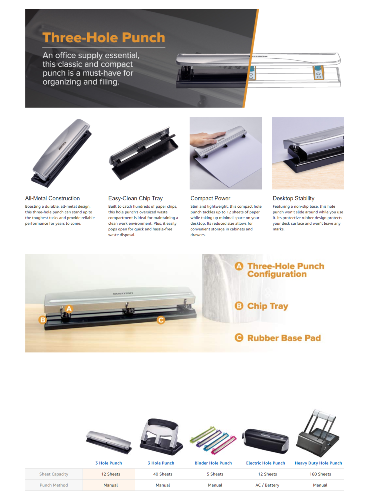
Bostitch, focuses less on it’s brand and more on calling out the key features of the product it is trying to sell. Following the principles of KISS, it has created a simple, beautiful and well-balanced product listing that also cross-sells products.

Coty Airspun stood out to us with a well-balanced mix of branded product photography and text and a unique and beautiful presentation of cross-sell products that used white space to visually break the block structure of the layout.

Gillette created very solid A+ Content with a striking introductory graphic that powerfully introduced the product, brand and lifestyle use at once. The listing as a whole is well balanced with strong images and rich copy. We would only suggest that the image blocks in the center reduce the image-based copy. It is hard to read and reduces the visual ease of navigating the content flow.

Mod Podge used an atypical layout for their content. They stuck with rows of 3 square content blocks and copy. They did so expertly. The listing first introduces the brand, then gives ideas on how to use the product, introduces other products and finally tells their parent brand story.

Blue Buffalo’s A+ Content is among the best. The Blue Buffalo brand makes a strong impression, the graphics clearly call attention to key product features and subtlety hint at others (ie. blending a US Flag into the background), they expertly tell their brand story and cross-sell other products.

Greenies should receive an award (beyond fabulous sales) for their A+ Content on this product page. The graphics are beautiful, informative and break the visual mold of the A+ layout. We quickly understand the brand, the product, it’s features/ use and what other products are available.

A+ Content doesn’t get much better than this. Kind uses photography and graphics masterfully to give consumers their brand story and product value proposition. They have created approachable copy and effectively cross-sell their products. This content is the “best in show” and should set a high standard for everyone else who endeavors to create A+ Content for their products.
Good luck with making your A+ Content. If you need help creating A+ Content or growing your Amazon business please fill out our contact form.